ReactNative导航新宠儿react-navigation
导航一直是App开发中比较重要的一个组件,ReactNative提供了两种导航组件供我们使用,分别是:NavigatorIOS和Navigator,但是前者只能用于iOS平台,后者在ReactNative0.44版本以后已经被移除了。好在有人提供了更好的导航组件,就是我们今天要讲的react-navigation,并且ReactNative官方更推荐我们使用此组件。
本篇文章只讲解基础用法,如果你想了解更多,请戳这里->戳我。
简介
react-navigation主要包括导航,底部tab,顶部tab,侧滑等,功能很强大,而且体验接近原生。今天我们介绍的组件分别为:
- 导航 -> StackNavigator
- 底部或者顶部
tab-> TabNavigator - 侧滑 -> DrawerNavigator
DrawerNavigator
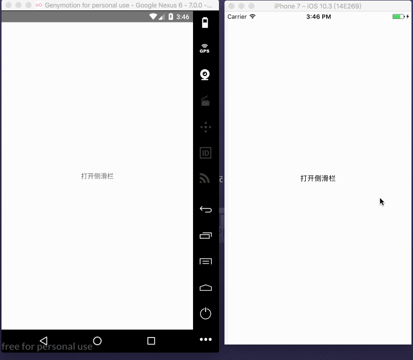
先来看看运行效果:

这里,我们定义三个界面,一个为根界面,一个主界面,一个侧滑界面,分别如下:
侧滑界面DrawerLeftPage.js:
|
这个界面很简单,我们定义了一个按钮,点击按钮的时候,关闭侧滑页,这里关闭的参数为DrawerClose,通过props属性可以拿到当前navigation。另外我们又定义了一个静态属性,来配置侧滑显示的具体属性。注意,此属性名一定要写成navigationOptions。
navigationOptions主要有以下参数:
title:通用标题,当你不写drawerLabel时,使用此参数作为侧滑标题,通常都不写drawerLabel:侧滑标题drawerIcon:侧滑的标题图标,这里会回传两个参数,{focused: boolean, tintColor: string},focused表示是否是选中状态,tintColor表示选中的颜色,这个颜色是我们自己在根视图定义的。当然,你也可以使用其他的组件来作为图标,比如Text。
主界面 DrawerHomePage.js
|
这个界面和上一个界面基本一样,只是这里的点击事件为打开抽屉,传的参数为DrawerOpen。
打开侧滑:this.props.navigation.navigate('DrawerOpen')
关闭侧滑:this.props.navigation.navigate('DrawerClose')
根视图 DrawerPage.js
|
这里我们从react-navigation导入侧滑组件DrawerNavigator,这里我们定义一个常量Drawer,主要来配置侧滑的各种参数。首先,看DrawerNavigator的构造方法:DrawerNavigator(RouteConfigs, DrawerNavigatorConfig)
这里接收两个参数,一个为页面路由配置,一个为显示的配置,我们分别来看,
RouteConfigs:
这里你可以配置所有的界面,例如,当前例子配置了两个界面:Home和Left,指定界面分别为DrawerHomePage和DrawerLeftPage。你还可以配置其他界面,这些配置的界面都将显示在侧滑栏上。
DrawerNavigatorConfig:
drawerWidth: 侧滑栏的宽度,如果你不想写死,可以使用Dimensions获取屏幕的宽度,动态计算drawerPosition: 侧滑的方向,left和right,默认leftcontentComponent: 这个就比较重要了,可以自定义侧滑页,我们等会详细说。contentOptions: 主要配置侧滑栏条目的属性,只对DrawerItems,例如我们刚才写的例子,就可以通过这个属性来配置颜色,背景色等。其主要属性有:items: 这个我也没弄清是什么意思,不影响activeItemKey: 定义当前选中的页面的keyactiveTintColor: 选中条目状态的文字颜色activeBackgroundColor: 选中条目的背景色inactiveTintColor: 未选中条目状态的文字颜色inactiveBackgroundColor: 未选中条目的背景色onItemPress: 选中条目的回调,这个参数属性为函数,会将当前路由回调过去style: 定义条目的颜色labelStyle: 定义条目文字的颜色
例如:
|
如此,DrawerNavigator的基本用法我们已经搞的差不多了,但是,这还不能满足我们的日常开发,因为我们的侧滑界面可不是这个样子的。
刚才还有个参数没有介绍,就是contentComponent,他就是用来自定义侧滑界面的。
上面的例子有一个问题,加入我们的item比较多,但是侧滑页面并不能滑动,这时,就要使用contentComponent来自定义界面,如下:
|
运行效果如下:

当然,我们完全可以自定义侧滑界面,并且不使用DrawerItems条目。如下:
|
我们这里定义了一个常量,返回DrawerLeftPage作为我们的侧滑界面,在DrawerLeftPage中就可以随意定制了。注意,一定要将props传递到下一个界面,否则通过props拿不到navigation。最终运行效果:
好了,DrawerNavigator我们已经了解完了。
StackNavigator
这个组件就比较麻烦了,我们先来看他的构造函数:StackNavigator(RouteConfigs, StackNavigatorConfig)
RouteConfigs:
它主要是来配置页面路由的,类似与Android的Manifest.xml,所有的界面都必须配置在里面。如下:
|
这里我们配置了首页和第二个页面,并且配置了标题参数。当然,如果你不想在路由里面配置页面的参数,你也可以在页面中配置,需要在页面中定义一个静态常量navigationOptions,和DrawerNavigator的使用方法类似。我们来看看navigationOptions有哪些可以配置的参数:
title: 这个即可以作为头部标题,也可以作为返回标题和Tab标题header: 自定义导航条,系统的导航条会隐藏headerTitle: 标题headerBackTitle: 回退标题headerTruncatedBackTitle: 当回退标题不能显示的时候显示此属性的标题,比如回退标题太长了headerRight: 定义导航栏右边视图headerLeft: 定义导航栏左边视图headerStyle: 定义导航栏的样式,比如背景色等headerTitleStyle: 定义标题的样式headerBackTitleStyle: 定义返回标题的样式headerTintColor: 定义导航条的tintColor,会覆盖headerTitleStyle中的颜色gesturesEnabled: 定义是否能侧滑返回,iOS默认true,Android默认false
示例如下:
|
StackNavigatorConfig
这个参数主要是配置整个路由的,包括跳转动画,跳转方式等。先来看看它有哪些参数:
initialRouteName: 初始化哪个界面为根界面,如果不配置,默认使用RouteConfigs中的第一个页面当做根界面initialRouteParams: 初始化根界面参数,主要是给根视图传递一些参数,通过this.props.navigation.state.params可以取到navigationOptions: 配置默认的navigationOptionspaths: 官方意思是覆盖已经配置的路由,可是我没有试出来效果mode: 跳转方式,一种是card,默认的,在iOS上是从右到左跳转,在Android上是从下到上,都是使用原生系统的默认跳转方式。一种是modal,只针对iOS平台,模态跳转。headerMode: 跳转过程中,导航条的动画效果,有三个值,float表示会渐变,类似于iOS的原生效果,screen表示没有渐变。none表示隐藏导航条cardStyle: 可以统一定义界面的颜色,例如背景色transitionConfig:配置页面跳转的动画onTransitionStart: 页面跳转动画即将开始的回调onTransitionEnd: 页面跳转动画结束的回调
|
Navigation Prop
了解完路由配置以后,我们再来看看组件的属性,
navigate:路由方法,主要来启动另一个页面state:状态,其实StackNavigator内部维护了两个路由栈,一个名为newState,是当前显示页面之前的所有页面,包括当前界面。一个名为lastState,当然,通过state还能拿到很多参数。setParams: 设置参数,记住,一定不要在render方法中调用此方法。goBack: 返回dispatch: 给当前界面设置action,会替换原来的跳转,回退等事件
navigate
此方法可以传三个参数:navigate(routeName, params, action)
routeName: 页面名称,一定要在路由配置中配置。params: 传递参数到下一个页面action:action
例如:
|
state
通过state,我们能拿到传递过来的参数,通过打印state,得到如下结果:
可以看到,通过state,我们可以拿到传递过来的params
setParams
设置当前页面的参数,记住,调用此方法一定要在componentDidMount
|
goBack
回退到指定界面,如果什么都不传,回退到上一个界面,传null,回退到任意界面。传key,可以回退到指定界面。例如:
|
关于react-navigation的基本用法已经了解的差不多了,至于更详细的用法,可以看官方文档。
注意:
全屏侧滑返回手势:系统默认有侧滑返回手势,距离屏幕距离为35,为了使用全屏侧滑,需要修改源码:在react-navigation/src/views/CardStack.js类,修改常量GESTURE_RESPONSE_DISTANCE_HORIZONTAL为Dimensions.get('window').width即可。
在iOS上,标题会居中,但是在Android上是居左的,想要Android上也居中,需要修改:react-navigation/src/views/Header.js中的title样式修改为center,并且在方法_renderTitle中注释掉
|
这几句代码。
TabNavigator
tab选项卡的功能,在iOS上默认类似于TabBar,在Android中类似于TabLayout,先来看看构造方法:
|
RouteConfigs
同样的,还是配置路由,如下:
|
当然,你也可以配置navigationOptions,但是,在这里配置的优先级比在页面中配置的优先级高,所以,我们一般再单个页面中配置所有的navigationOptions。
TabNavigatorConfig
tabBarComponent: 默认两种方式,TabBarBottom和TabBarTop,可以通过如下代码导入:import {TabBarBottom,TabBarTop} from 'react-navigation';,这两者的区别主要是样式和位置的区别,iOS上默认使用TabBarBottom,Android上默认使用TabBarTop。tabBarPosition: 配置tab的位置,top和bottomswipeEnabled: 是否可以滑动切换tabanimationEnabled: 点击选项卡切换界面是否需要动画lazy: 是否懒加载界面,默认一次加载所有的界面,我们最好设置为truetabBarOptions:tab的样式等配置,我们下面详细说initialRouteName,第一次初始化哪个界面,默认初始化第一个。order,tab排序,默认使用配置路由的顺序paths: 配置pathbackBehavior,当Android点击返回键的时候,做的处理,initialRoute返回到初始化的界面,none退出应用
例子如下:
|
tabBarOptions
这个参数主要配置样式,针对TabBarBottom和TabBarTop。
TabBarBottom:
activeTintColor: 选中的文字颜色activeBackgroundColor: 选中的背景色inactiveTintColor: 未选中的文字颜色inactiveBackgroundColor: 未选中的背景色showLabel: 是否显示标题,默认显示style: 定义item的样式labelStyle: 标题的样式
例如:
TabBarTop:
activeTintColor: 选中的文字颜色inactiveTintColor: 未选中的文字颜色showIcon: 是否显示图标,默认显示showLabel: 是否显示标题,默认显示upperCaseLabel: 使用大写字母pressColor: 定义颜色,大于Android5.0的一种按压效果pressOpacity: 按压下去的透明度,在iOS或者Android5.0之前scrollEnabled: 是否能够滚动,类似于今日头条的标题头tabStyle: 定义item的样式indicatorStyle: 指示器的颜色labelStyle: 文字的样式iconStyle: 图标的样式style: 定义tab的样式
例如:
NavigationOptions
当然,通过NavigationOptions来配置我们的tabBarItem:
title: 标题tabBarVisible: 是否可见tabBarIcon: 配置图片,当然,完全可以不使用图片tabBarLabel: 也是配置标题,只不过title既能配置tab的标题,也能配置navigation的标题
例如:
好了,TabNavigator也说的差不多了。当然,如果你想在某个界面切换tab,使用如下方法:
仿QQ主界面
下面的例子是仿QQ主界面的,当然包括本篇文章的实例代码,请戳这里->戳我。
运行效果: