一天一Android之布局
今天主要说说布局。我在看Android的任何内容的时候,心中总要和iOS进行一番比较,就说布局吧,在iOS中,我们一般直接使用frame计算、AutoLayout约束布局。在Android的世界中,一般使用xml布局文件来进行布局,用到的布局方式有四种:线性布局、相对布局、帧布局、百分比布局。还有一种是直接使用图形化添加约束:ConstraintLayout。为何Android的布局方式如此的多,主要是因为Android屏幕的碎片化,不像苹果就那几款手机。
线性布局-LinearLayout
LinearLayout又称作线性布局,正如它的名字所描述的一样,这个布局会将它所包含的控件在线性方向上依次排列。线性布局的两种排法:
从左到右
android:orientation="horizontal"从上到下
android:orientation="vertical"
默认的布局方向为:horizontal,这里需要注意,如果LinearLayout的排列方向是horizontal,内部的控件就绝不能将宽度指定为match_parent,因为这个控件会把整个水平方向占满。同理,如果排列方向为vertical,就不能将控件的高度设置为match_parent。
layout_gravity
layout_gravity用于指定控件在布局中的对齐方式,当LinearLayout的排列方向是vertical时,只有水平方向上(center_horizontal)的对其方式才会生效,同理,当LinearLayout的排列方向是horizontal时,只有垂直方向上(center_vertical)的对其方式才会生效。
layout_weight
layout_weight这个属性允许我们使用比例的方式来指定控件的大小,例如如下代码:
|
实现的效果:
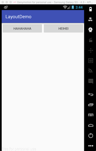
我们看到两个按钮平分了屏幕的水平空间,当然在开发的过程中,我们可以灵活的使用此属性。
相对布局-RelativeLayout
RelativeLayout又称为相对布局,也是一种常用的布局,能通过相对定位的方式让控件出现在布局的任何位置,所以相对布局的属性非常的多,我们看看:
属性值是true或false
android:layout_centerHrizontal水平居中android:layout_centerVertical垂直居中android:layout_centerInparent相对于父元素完全居中android:layout_alignParentBottom位于父元素的下边缘android:layout_alignParentTop位于父元素的上边缘android:layout_alignParentLeft位于父元素的左边缘android:layout_alignParentRight位于父元素的右边缘
属性值是
@id/*android:layout_below在某元素的下方android:layout_above在某元素的上方andorid:layout_toRightOf在某元素的右方android:layout_toLeftOf在某元素的左方android:layout_alignBottom和某元素下方对齐android:layout_alignTop和某元素上方对齐android:layout_alignRight和某元素右方对齐android:layout_alignLeft和某元素左方对齐
属性值是数值
android:layout_marginLeft离某元素左边缘的距离android:layout_marginRight离某元素右边缘的距离android:layout_marginTop离某元素上边缘的距离android:layout_marginBottom离某元素下边缘的距离
我写了一个简单的小例子:
|
运行实例如下:

注意:
- 如果没有定义左右,那么默认在左边,如果没有定义上下,默认在上边。
- 相同位置,新定义的元素会覆盖旧的元素。例:1被2覆盖了。
- 4只定义了在父元素的下部,左右没定义,于是默认就在左边了。
android:layout_below,在某元素的下部并不意味着就一定是紧随某元素,只是在下部默位置。例如:5是在3的下部,但是是在下部的默认左边。- 6为下边缘对其3,7位marginLeft=150dp。
- 8为多个属性共同定义的结果。首先是在3的右部,然后是垂直居中,然后marginLeft=100dp得到最后位置。
帧布局-FrameLayout
FrameLayout称为帧布局,它相较于前面两种布局就简单多了,这种布局没有方便的定位方式,所有的控件都会默认摆放在布局的左上角。我们可以使用layout_gravity属性来指定控件在布局中的对齐方式,和LinearLayout中的用法是相似的,由于这种布局用到的很少,这里就不说了。
百分比布局
通过学习上面的三种布局,我们会发现,只有LinearLayout支持使用layout_weight属性来实现按比例指定控大小的功能,其他两种布局都不支持。为此,Android引入了一种全新的布局方式——百分比布局。
由于LinearLayout本身已经支持按比例指定控件的大小了,因此百分比布局只为FrameLayout和RelativeLayout进行了功能的扩展,提供了PercentFrameLayout和PercentRelativeLayout。
不同于上面的三种布局,Android团队将百分比布局定义在了support库中,我们需要在build.gradle中添加百分比布局库的依赖。
|
在导入百分比布局的时候,我们需要把完整的包名路径写出来,然后还必须定义一个app的命名空间,这样才能使用百分比布局的自定义属性。
|
注意,我在写这段代码的时候,IDE不会自动提示~
效果图:

约束布局-ConstraintLayout
看到这个布局我就想到了iOS的AutoLayout,他的用法和iOS的xib添加约束一样,用着也是很方便的。
ConstraintLayout是Android Studio2.2新添加的功能,虽然传统布局也可以使用可视化界面拖动空间布局,但是因为不够灵活,我们还是会选择xml代码来布局。而ConstraintLayout的出现将我们带入可视化布局编程的新纪元,通过建立空间之间的约束,实现布局的构建。这样做有一个很大的优点,就是减少了布局的嵌套,减少了布局渲染的层数,降低了CPU的消耗,提高了程序的性能。总之就是优点很多。
建立依赖
在使用ConstraintLayout布局之前,我们需要在build.gradle添加依赖,但是,通常情况下不需要我们手动添加,IDE已经为我们自动添加好了。如下:
|
切换视图
点击菜单栏的中的Show Design、Show Blueprint和Show Design + Blueprint按钮可以对操作视图进行切换,如下图所示:

添加约束
我们创建一个按钮,并为它添加约束:

可以看到,按钮控件有四个方向的约束,如下图所示,按钮的上、下、左、右边上各有一个小圆圈,鼠标可拖动小圆圈到ConstraintLayout,与其添加约束。

如将按钮下边圆圈拖至ConstraintLayout底部,则按钮移动至底部;再将按钮上边圆圈拖动至ConstraintLayout顶部,垂直方向上有两个约束的按钮控件就会实现垂直居中。

约束位置比例调整
当然如果ConstraintLayout添加约束仅仅能实现水平、垂直居中,那么它在功能上与RelativeLayout就没有差别了。除了居中,约束还可以设置控件两边到边界之间的距离比例,通过在右侧属性面板中,拖动水平和垂直方向的进度条来调整两边距离的比例。

控件之间添加约束
除了与ConstraintLayout添加约束,控件与控件之间同样可以添加约束。如下图所示,在调整按钮宽度后,将两个按钮的左右两边添加约束,然后将下方按钮的上边与上方按钮的下边添加约束,拖动下方的按钮,可设置两个按钮之间的外边距。

通过控件之间添加约束和调整约束距离比例,开发者可实现较为复杂的约束。


调整控件外边距及尺寸
你可能会发现,在调整控件位置的比例的时候,当进度条滑动至100时,控件未能完全贴上布局的右边界,这是因为控件存在外边距。

这时候可以修改属性面板中的数值来调整控件的外边距大小,如下图所示:

在控件尺寸调整上,ConstraintLayout提供了三种模式,在属性面板中点击下图红色框框区域实现模式的切换。

这三种分别为:
- wrap content

wrap content模式就是平时常用的根据内容来设定控件尺寸。
- 固定值

固定值模式也是平时常用的,通过设定具体数值来确定控件的大小。如下图所示,切换为固定模式后,在下方的layout_width一栏填写具体的宽度数值。

- any size

any size与match parent类似,都是充满整个范围,但是不同点在于match parent充满相对于父容器,而any size是相对于约束条件,即在约束条件下,能填充的范围全部充满,如下图所示:

这里说明一下,ConstraintLayout其实也有match parent模式,但是因为ConstraintLayout不存在多层嵌套关系,所以match parent这种相对于父容器的模式在ConstraintLayout中很少会使用。
删除约束
删除约束有三种方式:
- 删除单个约束
将鼠标移动到要删除的约束对应的小圆圈,待小圆圈出现闪烁的红色圈圈时,点击小圆圈即可删除约束。

除了上面这种删除方法,也可以在属性面板中,将鼠标移动到下图红色框框标记的位置,待出现叉叉图标,点击可删除该约束。

- 删除单个控件的所有约束
用鼠标点击控件,在其左下方会出现一个小叉叉图标,点击小图标即可删除当前控件的所有约束。

- 删除当前界面的所有约束
点击工具栏中删除所有约束图标的按钮,即可删除当前界面所有的约束。

Guidelines
学完基本的依赖操作,来看一下ConstraintLayout的进阶用法。这里有一个需求,要求将两个控件合在一起,实现水平居中。如果不使用ConstraintLayout,我们或许会想到用RelativeLayout嵌套LinearLayout来实现。那么在ConstraintLayout这样不存在多布局嵌套的情况下该怎么实现呢?
这时候就提出了Guidelines,GuideLines就如同Photoshop中参考线的概念一样。如下图,创建一个垂直方向的参考线,将其切换至百分比模式,拖动到50%的位置,再将两个控件在左右两侧分别与Guidelines添加约束,然后两个控件的底边相互添加约束即可实现合并居中的效果。此时ConstraintLayout展现了其强大的优势,通过其特性优雅地完成需求。

我们不仅可以创建垂直方向的引导线,还可以创建水平方向上的引导线。
Autoconnect
或许因为我们是第一次接触ConstraintLayout,所以感觉添加约束的操作很有趣,但是在项目中,当控件数量比较多时,每个控件的每条边都要一个一个添加约束,这样就会拖慢开发效率,所以ConstraintLayout提出了Autoconnect的用法。
如下图所示,单击打开工具栏中Autoconnect功能按钮,将控件拖至屏幕中心,然后约束就会自动添加了。

Autoconnect会根据我们的意图来判断是否添加相应的约束,当然自动添加的约束不一定全是想要的效果,这时候可以关闭Autoconnect,然后手动修改约束。

Inference
Inference与Autoconnect功能相同,都是用于自动添加约束的,但是Inference更加强大。Inference是手动添加约束后,对当前界面所有控件的位置关系添加整体约束关系,感觉和Photoshop里面不同布局中的图像调整好位置后合并可见图层很像。Inference操作如下图所示:

小结
Android的布局差不多就这么多,学会这些布局,我想足够能让我在以后的开发中顺利的进行。